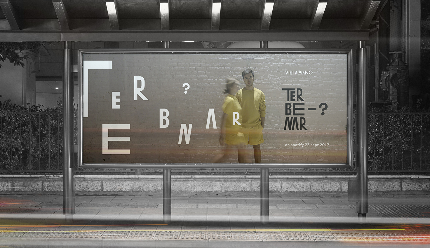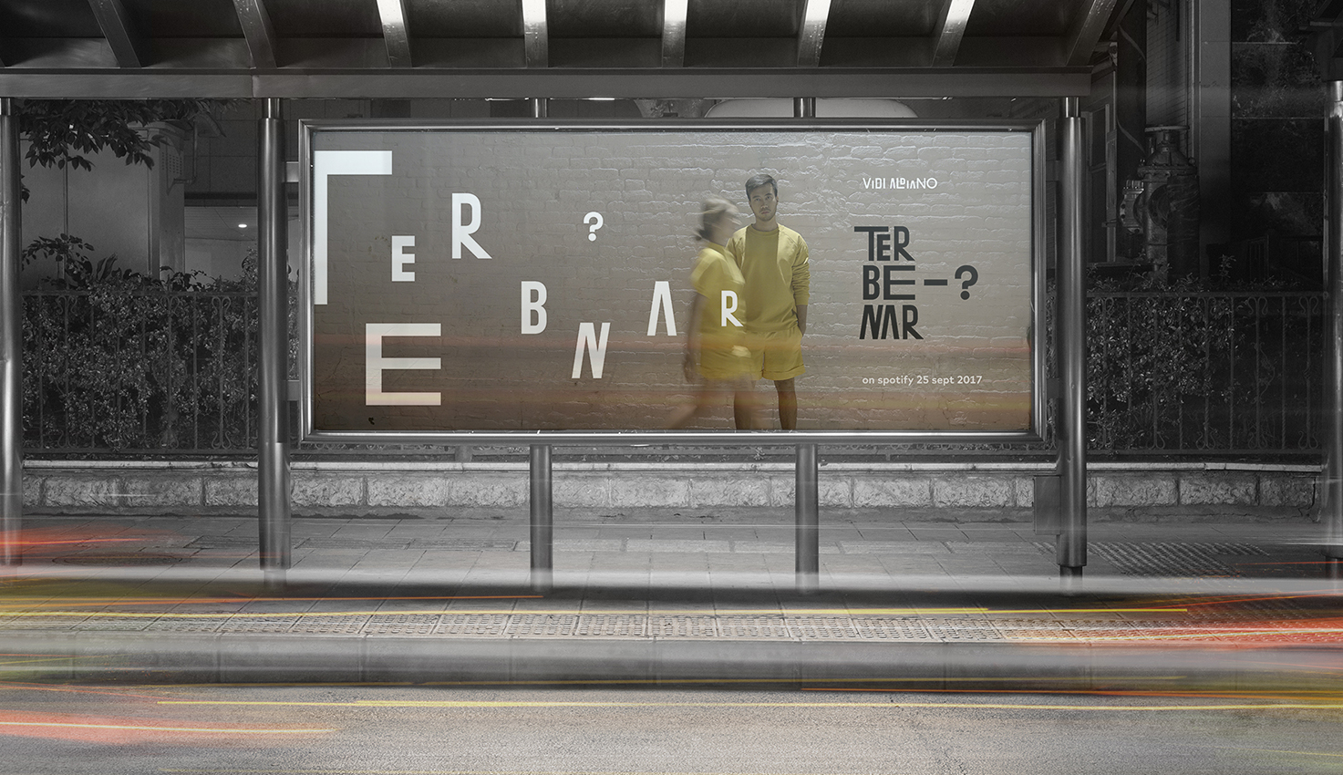
Vidi Aldiano “Terbenar”
Initiative Project
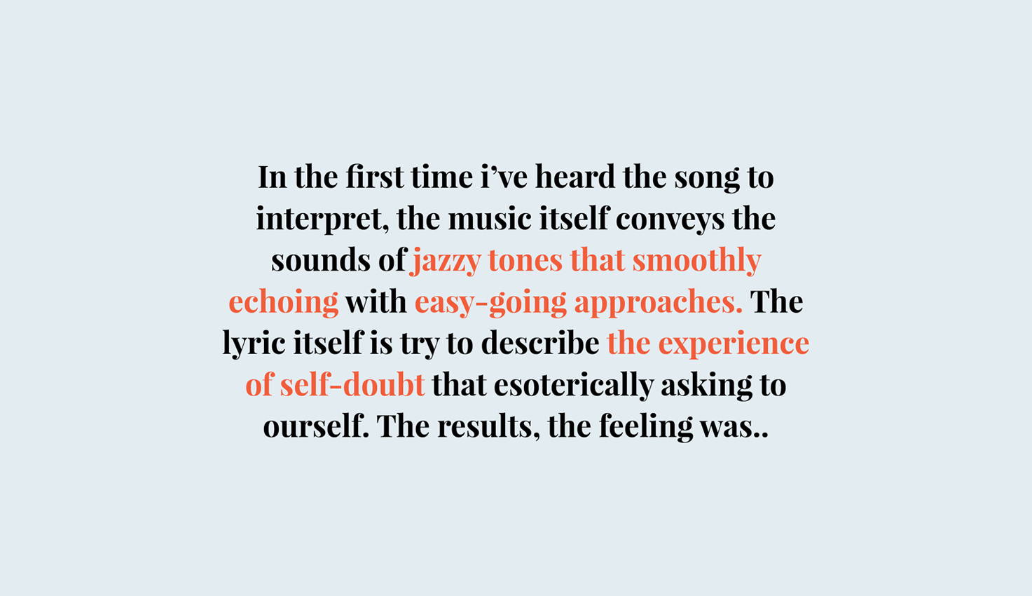
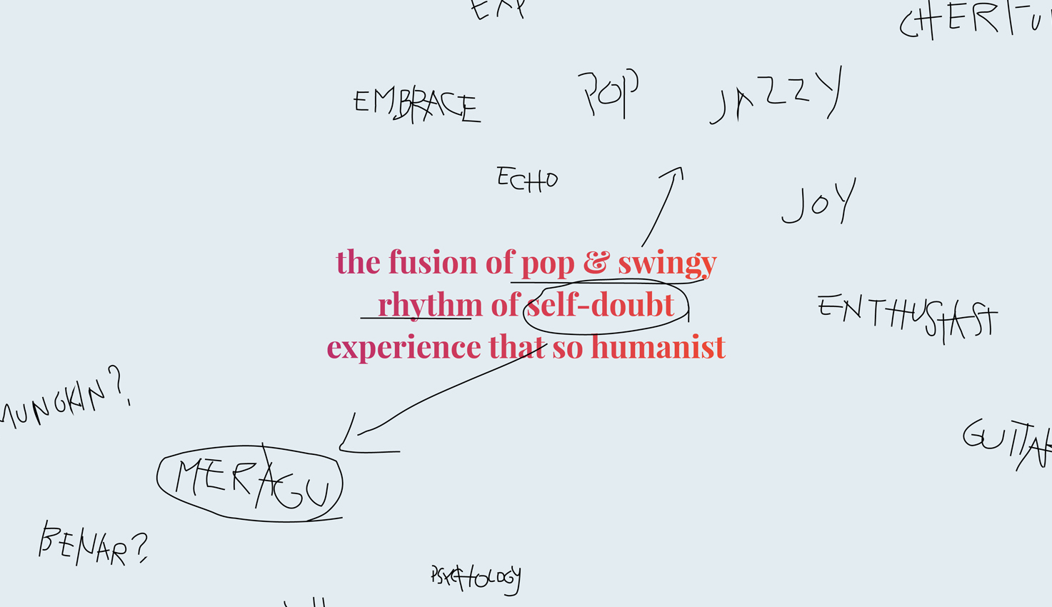
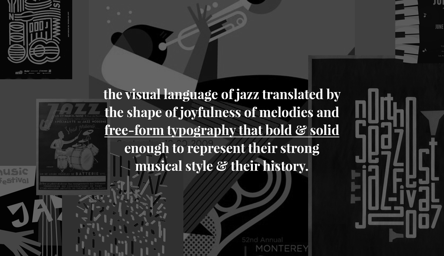
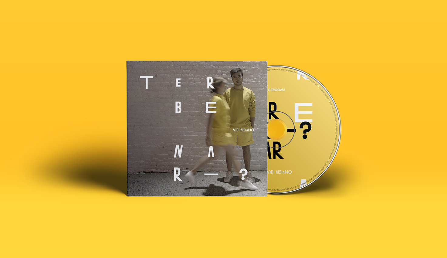
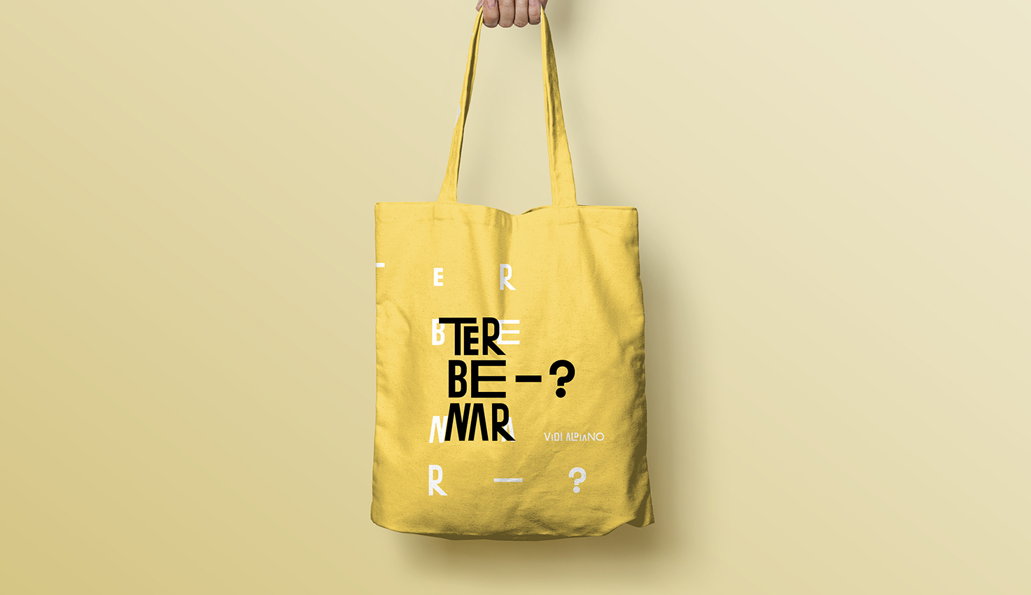
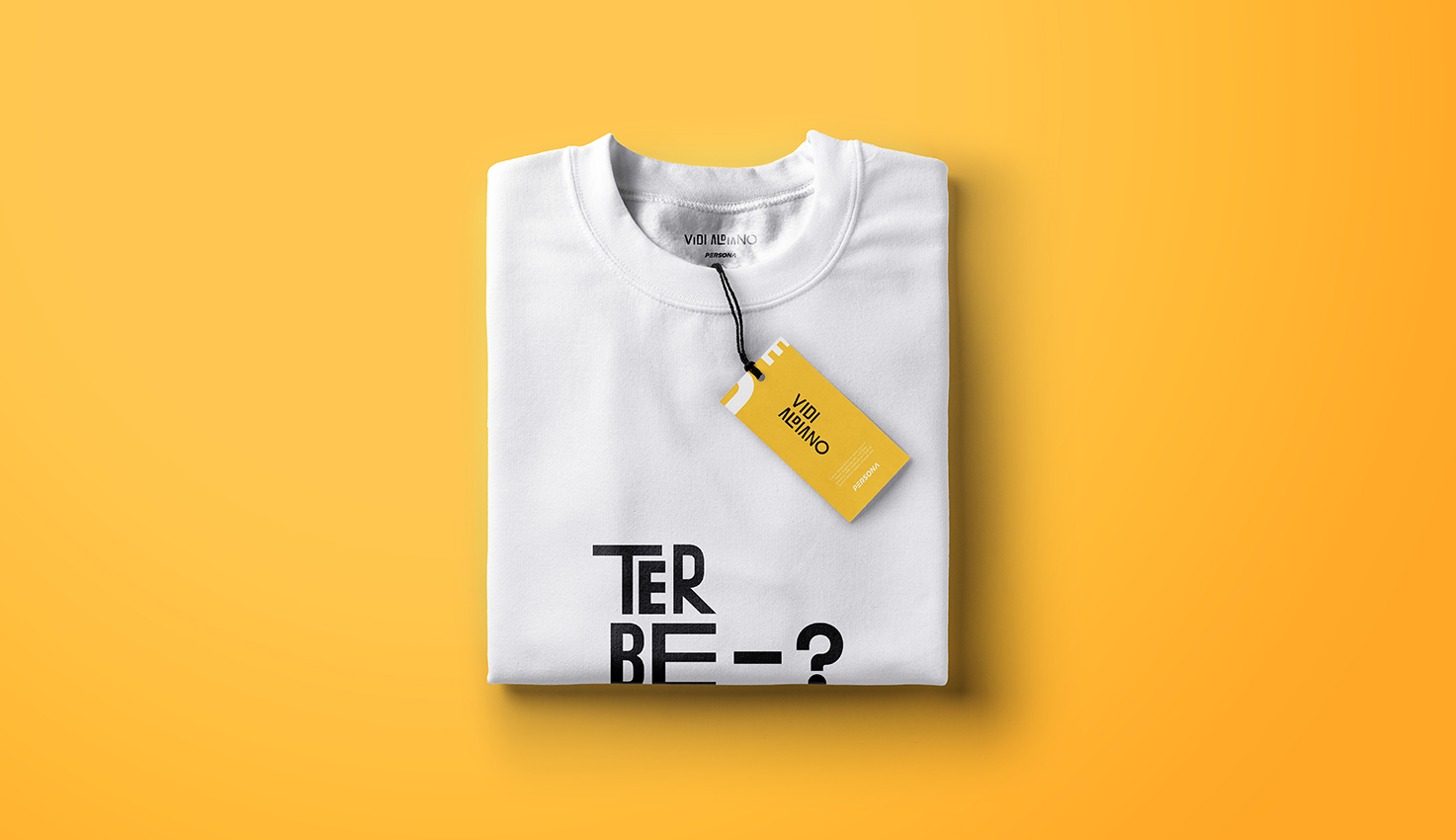
Typography respond on Vidi Aldiano newest single “Terbenar?” – A modular type that spontaneously arranged within the swingy guitar echoes and songs context about the experiencing self-doubt that rhetorically asks our self in a complicated lovers conditions. Technically, sans-serif used because it has high legibility on a small screen—like in a Spotify/Instagram thumbnails which easier for the user to read; influenced by the jazz gigs poster that has a bold-and-free-form of typography, especially like Paula Scher did on the Public Theather or David Carson works. Well, it seems like 15 minutes technically design it, but a deeper understanding of what I’m doing in exact-short time.